

Beyond the Label: Decoding the Modern Drinker’s Decision at the Beer Cooler
The craft beer aisle has become the most competitive gallery in the world. In a space where a single shelf might hold forty different IPAs, the "six-second window"—the time it takes for a consumer to scan, reach, and commit—is the most valuable real estate in the industry.
For years, we’ve heard that "people buy with their eyes." But as the market matures and Gen Z enters the fold with entirely different values than the Millennial craft pioneers, the definition of a "good label" is shifting. It’s no longer just about the loudest colors or the weirdest names. It is about a sophisticated hierarchy of information that balances art with utility.
The New Hierarchy: Communication Over Expression
One of the biggest disconnects currently facing the industry is how breweries view their cans versus how drinkers use them. For a brewer, the can is a canvas—a place for artistic expression, puns, and brand storytelling. For the drinker, the can is a decision tool.
When a consumer stands in front of a reach-in cooler, their brain is filtering for three things in a specific order:
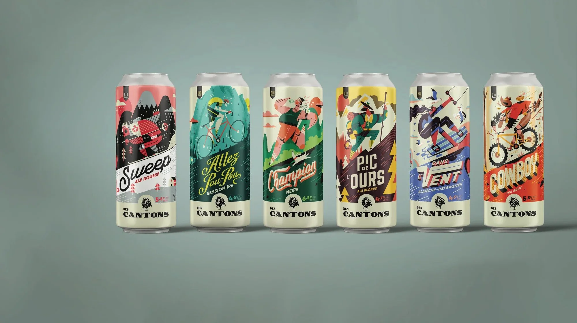
The Style: Is this a Lager, a Hazy IPA, or a Pastry Stout?
The ABV: Is this a "one-and-done" 9% double or a 4.2% sessionable afternoon beer?
The Brand: Is this a brewery I trust?
If a label prioritizes a trippy illustration over the word "Pilsner," the brain has to work harder. In a saturated market, "work" equals a "skip." Recent industry observations suggest that the most successful designs in 2025 and 2026 are those that embrace "Restrained Boldness"—using negative space to make the vital stats (Style and ABV) pop against the artistic background.
The Freshness Paradox
There is a growing tension in the craft community regarding transparency—specifically, the "Packaged On" vs. "Best By" debate. For the hardcore enthusiast, a "Best By" date feels like a shell game. Does "Best By August" mean it was canned in February or May?
This skepticism is becoming a primary driver of purchase. A consumer might love a brand’s aesthetic, but if they have to flip the can upside down and squint to find a smudged thermal-ink date on the bottom, they often put it back.
We’ve seen a shift where breweries are starting to incorporate "Born On" dates into the label design itself, treating freshness as a feature rather than a footnote. As explored in BevWire’s recent editorial on what drinkers notice first, this hierarchy of information—from the aesthetic hook to the technical data—is what separates a one-time purchase from a loyal brand advocate.
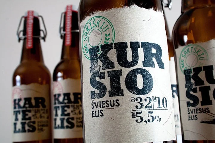
Custom label for Lithuanian brewery SAKISKIU ALUS designed by Sigitas Guzauskas
The Tactile Trend: Why 2026 is the Year of "Feel"
As digital fatigue sets in, the physical sensation of the can is becoming a differentiator. We are seeing a massive surge in:
Textured Finishes: Embossed lettering and "sandpaper" matte finishes that provide a grip-feel.
Variable Printing: Digital printing technology now allows breweries to have slight variations in every can in a 4-pack, creating a "collectible" feel.
Sustainability Signaling: It’s not just about the label anymore, but the carrier. Moving away from plastic "Pak-Techs" to recyclable paperboard carriers is now a visual cue for quality and ethics.
The "Zebra Striping" Effect and Labeling
Another trend hitting the shelves is the rise of "Zebra Striping"—the consumer habit of alternating between high-ABV craft and non-alcoholic (NA) options in a single session. This has led to a fascinating evolution in labeling: NA beers that look exactly like their alcoholic counterparts.
Drinkers no longer want the "blue can" that screams "I’m not drinking." They want a label that fits the social aesthetic of the craft scene. This means the visual cues we associate with "Premium Craft"—minimalist typography, local landscape art, and specific color palettes—are being applied across the board, regardless of the alcohol content.
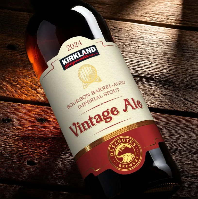
2025 Craft Beer Marketing Awards platinum winner for best bottle label “Kirkland & Deschutes Collaboration - Barrel-Aged Vintage Ale”
Conclusion: Art that Serves the Consumer
The most beautiful label in the world will fail if it forgets its primary job: to tell the drinker what is inside and why it matters to them right now.
As we move further into 2026, the breweries that win won't necessarily be the ones with the most expensive graphic designers. They will be the ones who understand the psychology of the aisle—the ones who provide the "Born On" dates clearly, make the style legible from three feet away, and use texture to create a physical connection before the first sip is even taken.